
Exploring Country Climate Statistics with NOAA Climate Data
In this blog post, we will be working with SQL querying and the python plotly package to generate insightful visualizations of the NOAA Climate Data.
Step 1. Creating a Database
The first step to querying with SQL is to create a database containing all the relevant tables. Here, we will be working with these tables (given as csv files):
-
temperatures: (giving temperatures at various weather stations all over the world for each month of each year )
-
countries: (a reference table providing the country code used for station identifiers in each country)
-
stations: (giving the name and location in latitude and longitude of each weather station) First we import pandas for dataframe manipulation and sqlite3 for SQL querying, and then we can begin reading the different csv files into dataframes.
import pandas as pd
import sqlite3
#read temperatures csv file
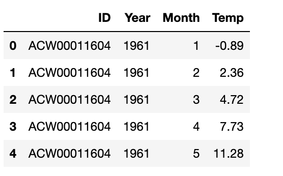
temps = pd.read_csv("temps_stacked.csv")
temps.head()
#read countries csv file
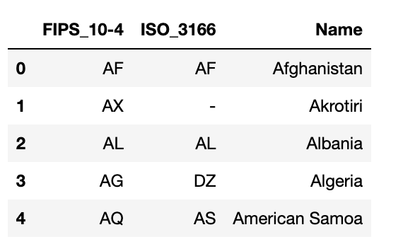
countries = pd.read_csv('countries.csv')
# whitespaces in column names are bad for SQL
countries = countries.rename(columns = {"FIPS 10-4": "FIPS_10-4"})
countries = countries.rename(columns = {"ISO 3166": "ISO_3166"})
countries.head()
#read stations csv file
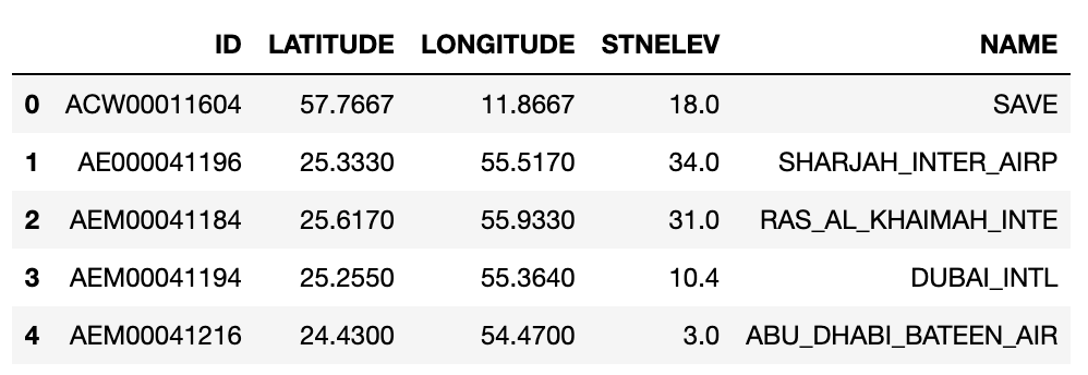
url = "https://raw.githubusercontent.com/PhilChodrow/PIC16B/master/datasets/noaa-ghcn/station-metadata.csv"
stations = pd.read_csv(url)
stations.head()
After reading these stations into pandas dataframes, we open a connection to our SQL database:
#sql database creation

#open a connection to temps.db so that you can talk to it using python
conn = sqlite3.connect("temps.db")

temps.to_sql("temperatures", conn, if_exists = "replace", index=False)
countries.to_sql("countries", conn, if_exists = "replace",  index=False)
stations.to_sql("stations", conn, if_exists = "replace",  index=False)

#always close your connection
conn.close()

#Check that the three tables are in temps.db
conn = sqlite3.connect("temps.db")

# query the database
cursor = conn.cursor()
cursor.execute("SELECT name FROM sqlite_master WHERE type='table'")
Here we will retrieve the data to check that all three dataframes are stored:
print(cursor.fetchall())

conn.close()

NOTE: Remember to always close the connection when you are done, as above.
Step 2. Write a climate database querying function
Next, we will write a querying function we can use to obtain some climate data from the database that is relevant to a particular query.
For example, here we have a querying function that returns a Pandas dataframe of temperature readings for the specified country, in the specified date range, in the specified month of the year.
def query_climate_database(country, year_begin, year_end, month):
'''
Provides a dataframe containing station names, locations, and
measurements for a specified country,
with all temperature readings inside that country from year_begin
to year_end, during the specified month
'''
#read the countries table into a pandas dataframe to get country id
conn = sqlite3.connect("temps.db")
cmd = "SELECT `FIPS_10-4`, name FROM countries"
countries_df = pd.read_sql(cmd, conn)
conn.close()
#check if inputted country name is in countries
if countries_df['Name'].str.contains(country).any():
countries_df = countries_df[countries_df['Name']==country]
else:
#otherwise, split up the inputted country name into a list of country name criteria for searching
#necessary because countries like 'South Korea' appear in the table as "Korea, South"
c_name_list = country.split()
for name in c_name_list:
#only keep countries with 'name' in their name
countries_df = countries_df[countries_df['Name'].str.contains(name)]
country_id = countries_df["FIPS_10-4"].item()
#query and return relevant temperatures
conn = sqlite3.connect("temps.db")
cmd = '''SELECT S.name, S.latitude, S.longitude, C.name Country, T.year, T.month, T.temp\
FROM temperatures T
LEFT JOIN stations S ON T.id = S.id
LEFT JOIN countries C ON substr(T.id,1,2) = C.`FIPS_10-4`
WHERE (substr(T.id,1,2) = \'''' + country_id + "') AND (T.month = " + str(month) \
+ ") AND (T.year BETWEEN " + str(year_begin) + " AND " + str(year_end) + ")"
df = pd.read_sql(cmd, conn)
conn.close()
return df
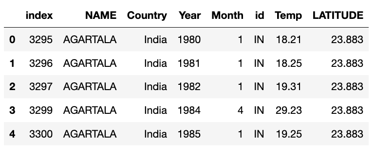
#Perform a test run
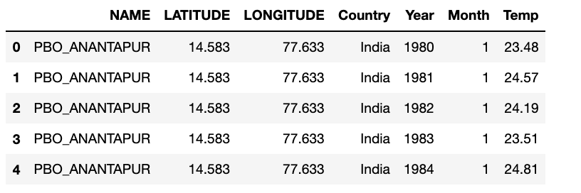
df1 = query_climate_database("India", 1980, 2020, 1)
df1.head()
Step 3. Write a geographic scatter function
Next, we will write a geographic scatterplot function to visualize this data on the world map using plotly! First we import the relevant packages. We import plotly.express for plotting, calendar to associate months with their indices, and (just for fun) we also import the LinearRegression tool from sklearn to generate a linear regression of our data.
import plotly.express as px
import calendar
from sklearn.linear_model import LinearRegression
Here’s a function to generate a linear regression from our data (you can skip this part if desired).
def coef(data_group):
X = data_group[["Year"]]
y = data_group["Temp"]
LR = LinearRegression()
LR.fit(X, y)
slope = LR.coef_[0]
return slope
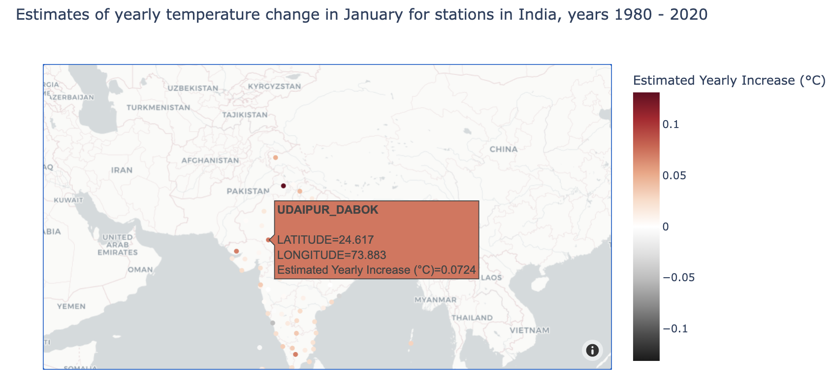
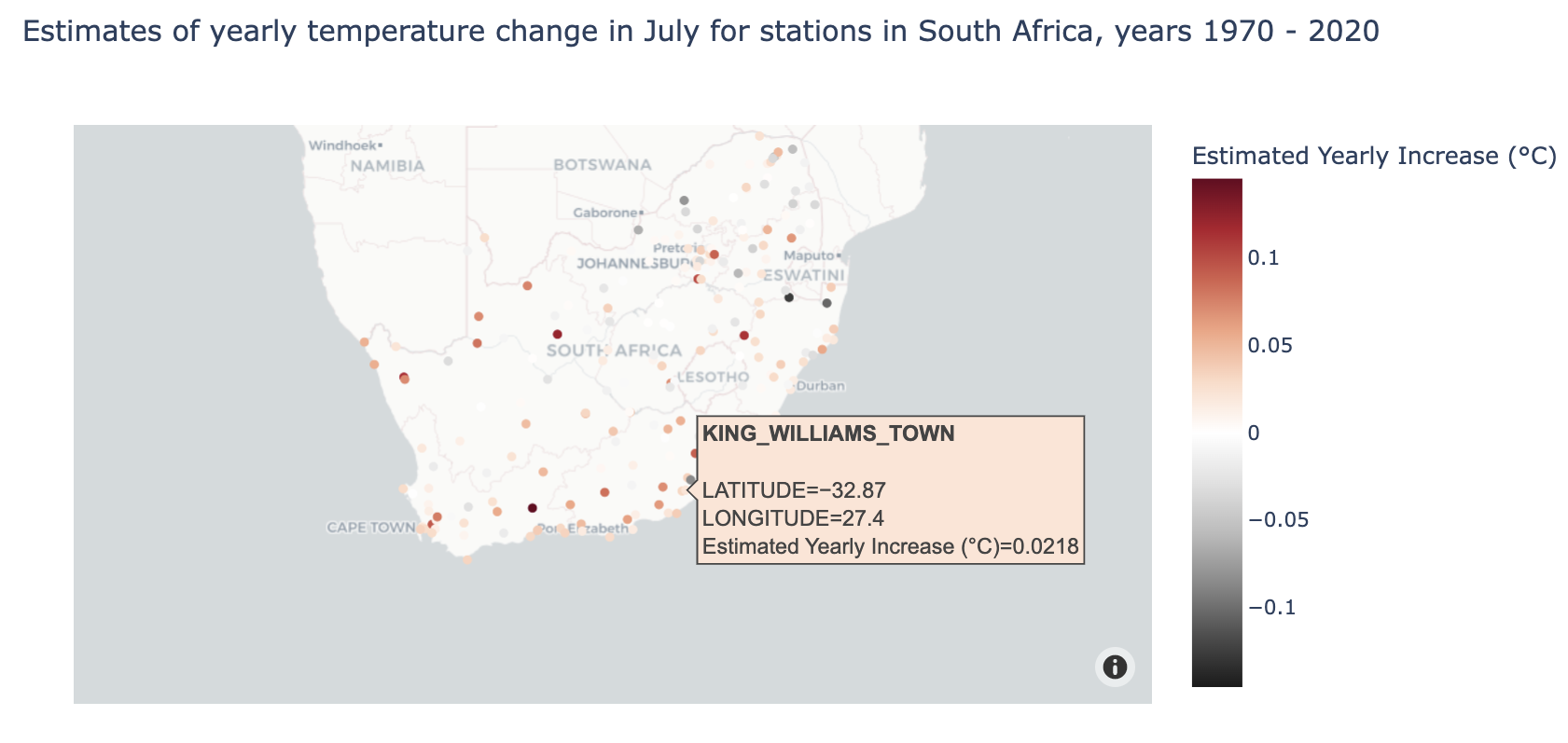
Next, we write our function to make a plot relevant to our research question. For example let’s say we wanted to answer the question:
How does the average yearly change in temperature vary within a given country?
This is what our function could look like:
def temperature_coefficient_plot(country, year_begin, year_end, month, min_obs, **kwargs):
'''
Returns a scatterplot with the average yearly increase (in celsius) in temperature
during the specified month over the specified year_span.
Stations must have a total number of observations >= min_obs
**kwargs get passed to px.scatter_mapbox() function
'''
#get the relevant dataframe from specified country, year span, and month
df = query_climate_database(country, year_begin, year_end, month)
#filter out stations with fewer years of data than min_obs
df['num_obs'] = df.groupby('NAME')['Year'].transform(len)
df = df[df['num_obs'] >= min_obs]
#create column 'Estimated Yearly Increase' containing slope of linear regression
coefs = df.groupby(["NAME", "Month","LATITUDE","LONGITUDE"]).apply(coef)
coefs = coefs.reset_index()
coefs.rename(columns={0: 'Estimated Yearly Increase (°C)'}, inplace = True)
coefs = coefs.round(4)
#make figure
fig = px.scatter_mapbox(coefs,
                    lat = "LATITUDE",
                    lon = "LONGITUDE",
                    hover_name = "NAME",
                    color = "Estimated Yearly Increase (°C)",
                    color_continuous_midpoint = 0,
                    title = "Estimates of yearly temperature change in "+ calendar.month_name[month] \
                        +" for stations in "+ country +", years "+str(year_begin) + " - "+ str(year_end),
                    **kwargs)
return fig
Let’s try getting estimates of yearly temperature changes in January in India from 1980-2020:
color_map = px.colors.diverging.RdGy_r # choose a colormap (this can be skipped)
fig1 = temperature_coefficient_plot("India", 1980, 2020, 1,
                                   min_obs = 10,
                                   #these next arguments get passed to the scatter_mapbox function
                                   zoom = 2,
                                   mapbox_style = "carto-positron",
                                   color_continuous_scale = color_map)
fig1.show()
Or perhaps we are interested in a different country, different time frame, and different month.
Step 4. More querying, more figures!
Now that we know the basics, let’s try writing a couple more querying functions and generating new visualizations to interpret different research questions.
Here’s a more versatile querying function that provides us with the temperature information for all countries in a given list, and for all desired months.
def query_climate_database_monthly(country_list, year_begin, year_end, month_list):
    '''
    This function returns dataframe conatining temperatures for specified country in country_list
    for multiple months for each year in year range
    '''
    #read the countries table into a pandas dataframe to get country id
    conn = sqlite3.connect("temps.db")
    cmd = "SELECT `FIPS_10-4`, name FROM countries"
    countries_df = pd.read_sql(cmd, conn)
    conn.close()
    #get country ids
    id_list = []
    for country in country_list:
        countries_df1 = countries_df.copy()
        #check if inputted country name is in countries
        if countries_df1['Name'].str.contains(country).any():
            countries_df1 = countries_df1[countries_df1['Name']==country]
        else:
        #otherwise, split up the inputted country name into a list of country name criteria for searching
        #necessary because countries like 'South Korea' appear in the table as "Korea, South"
            c_name_list = country.split()
            for name in c_name_list:
                #only keep countries with 'name' in their name
                countries_df1 = countries_df1[countries_df1['Name'].str.contains(name)]
        country_id = countries_df1["FIPS_10-4"].item()
        id_list.append(country_id)

    #query and return relevant temperatures
    conn = sqlite3.connect("temps.db")
    cmd = '''SELECT S.name, C.name Country, T.year, T.month, substr(T.id,1,2) id, T.temp, S.latitude\
    FROM temperatures T
    LEFT JOIN stations S ON T.id = S.id
    LEFT JOIN countries C ON substr(T.id,1,2) = C.`FIPS_10-4`
    WHERE (T.year BETWEEN ''' + str(year_begin) + " AND " + str(year_end) + ") \
    GROUP by S.name, T.year"
    df = pd.read_sql(cmd, conn)
    conn.close()
    #select only countries in country_list
    df = df[df['id'].isin(id_list)]
    #select only months in month_list
    df = df[df['Month'].isin(month_list)]
    df = df.reset_index()

    return df

#Let's do a test run
df1 = query_climate_database_monthly(["India"], 1980, 2020, [1, 4, 7, 9])
df1.head()
Now let’s consider a new research question:
How do the temperature readings for given months vary in a given country over time?
Let’s use a scatterplot to visualize these results. Since we want to observe temperatures for specific months, we can use facets to observe change in different months over tim, in the same plot!
Here’s our plotting function:
#this function will return the month name corresponding to digit x (i.e. 2 = "February")
def month_name(x):
    return calendar.month_name[x]

def temperature_monthly_scatterplot(country, year_begin, year_end, month_list, min_obs, **kwargs):
'''
Returns a scatterplot of the temperature readings for all stations in the specified country
with number of observations > min_obs from year_begin to year_end.
Scatterplot is stratified by desired months, given in month_list
'''
df = query_climate_database_monthly([country], year_begin, year_end, month_list)
#get number of observations
df['num_obs'] = df.groupby('NAME')['Year'].transform(len)
df = df[df['num_obs'] >= min_obs]
#sort dataframe by month
df = df.sort_values(by = ['Month'], ascending = True)
#name months
df['Month'] = df['Month'].transform(month_name)

#make figure title
fig_title = "Yearly Temperatures from "+ str(year_begin) + " to " +str(year_end) + " in " + country
if len(month_list) == 1:
    fig_title += "<br>for the month of " + month_name(month_list[0])
else: #properly format list of months if more than one are provided
    fig_title += "<br>for the months of " + month_name(month_list[0])
    for month in month_list[1:len(month_list)-1]:
        fig_title += ", " + month_name(month)
    fig_title += ", and " + month_name(month_list[-1])

#make figure
fig = px.scatter(data_frame = df,
                 x = "Year",
                 y = "Temp",
                title = fig_title,
                labels = {"Temp" : "Temperature (°C)", "LATITUDE" : "Latitude"},
                 hover_name = "NAME",
                 facet_col = "Country",
                  facet_row = "Month",
                 color = "LATITUDE", **kwargs)
#center the plot title
fig.update_layout(title_x=0.5)

return fig
Notice that since there’s a good chance that the latitude of station would impact it’s temperature, so we decided to color countries by latitude.
Let’s try visualizing the change in yearly temperatures from 1970 to 2020 in India at various points in the year, e.g. January, April, July, and November.
fig1 = temperature_monthly_scatterplot("India", 1970, 2020, [1, 4, 7, 9],
                                       min_obs = 1,
                                       trendline = "ols",
                                      width = 900,
                                      height = 800)

fig1.show()
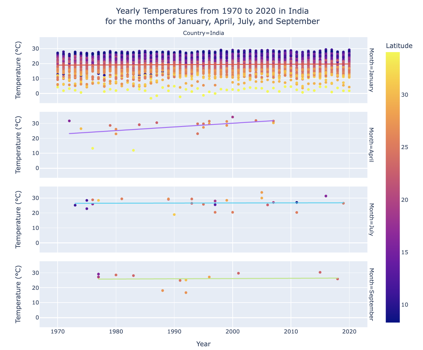
See, the great thing about facets is that now we can compare how the temperature changes across given months! While still comparing change over time!
Let’s try another research question:
How does the average yearly change in temperature compare between certain countries?
Here’s another querying function that gives average temperatures for each year for a list of countries:
def query_climate_database_yearly(country_list, year_begin, year_end):
'''
query function that returns temperature averages over each year for each station in specified countries & year range
This function returns dataframe conatining average temperature for each country in country_list
for multiple months for each year in year range
'''
#read the countries table into a pandas dataframe to get country id
conn = sqlite3.connect("temps.db")
cmd = "SELECT `FIPS_10-4`, name FROM countries"
countries_df = pd.read_sql(cmd, conn)
conn.close()
#get country ids
id_list = []
for country in country_list:
countries_df1 = countries_df.copy()
#check if inputted country name is in countries
if countries_df1['Name'].str.contains(country).any():
countries_df1 = countries_df1[countries_df1['Name']==country]
else:
#otherwise, split up the inputted country name into a list of country name criteria for searching
#necessary because countries like 'South Korea' appear in the table as "Korea, South"
c_name_list = country.split()
for name in c_name_list:
#only keep countries with 'name' in their name
countries_df1 = countries_df1[countries_df1['Name'].str.contains(name)]
country_id = countries_df1["FIPS_10-4"].item()
id_list.append(country_id)
#query and return relevant temperatures
conn = sqlite3.connect("temps.db")
cmd = '''SELECT S.name, C.name Country, T.year, T.month, substr(T.id,1,2) id, S.latitude, AVG(T.temp) mean_temp\
FROM temperatures T
LEFT JOIN stations S ON T.id = S.id
LEFT JOIN countries C ON substr(T.id,1,2) = C.`FIPS_10-4`
WHERE (T.year BETWEEN ''' + str(year_begin) + " AND " + str(year_end) + ") \
GROUP by S.name, T.year"
df = pd.read_sql(cmd, conn)
conn.close()
#select only countries in country_list
df = df[df['id'].isin(id_list)]
return df
#test run
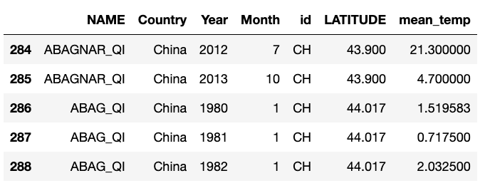
df1 = query_climate_database_yearly(["India", "China", "Sweden", "Egypt"], 1980, 2020)
df1.head()
Now that we have our querying function, we can write a plotting function. Let’s use box plots this time. We can differentiate between countries using the ‘color’ attribute.
#boxplot function
def temperature_bycountry_boxplot(country_list, year_begin, year_end, min_obs, **kwargs):
    '''
    Returns a boxplot
    comparing distribution of yearly averages across given year span,
    between different countries (differentiated by color)
    '''
    df = query_climate_database_yearly(country_list, year_begin, year_end)
    #get number of observations
    df['num_obs'] = df.groupby('NAME')['Year'].transform(len)
    df = df[df['num_obs'] >= min_obs]

    #make figure title
    fig_title = "Average Yearly Temperature Distributions from "+ str(year_begin) + " to " +str(year_end)
    #properly format list of countries if more than one are provided
    fig_title += "<br>in " + country_list[0]
    for country in country_list[1:len(country_list)-1]:
        fig_title += ", " + str(country)
    fig_title += ", and " + country_list[-1]

    #make boxplot
    fig = px.box(data_frame = df,
                 x = "Year",
                 y = "mean_temp",
                 title = fig_title,
                 labels = {"mean_temp" : "Mean Temperature (°C)"},
                 color = "Country", #seperate countries by color
                **kwargs)

    #center the plot title
    fig.update_layout(title_x=0.5)
    return fig
Let’s compare countries with different climates. We’ll choose India, Denmark, and Egypt, and plot the average yearly temperature distribution across these countries from 1990 to 2010.
fig1 = temperature_bycountry_boxplot(["India", "Denmark","Egypt"], 1990, 2010, min_obs = 5)
fig1.show()
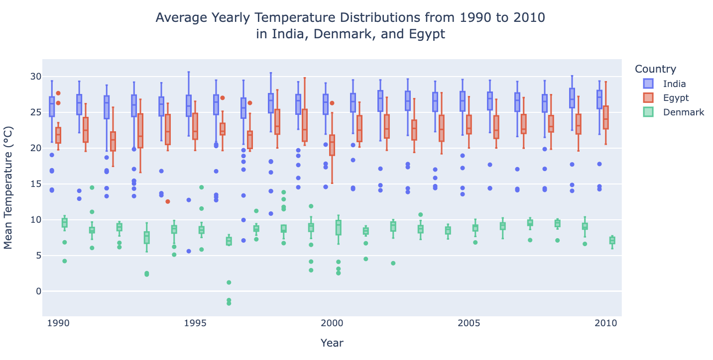
This way we can see which points are outliers, and see how these distributions change over time.
There we have it!
That concludes this tutorial, feel free to explore other querying strategies and plotting functions and generate visualizations to your own research questions!