
Visualizing the Palmer Penguins Data Set with Plotly
Step 1. Read the data into Python using pandas
The pandas Python package allows us to read the data set, and facilitates data manipulation. After importing the pandas package, we read the url containing our dataset into pandas with the read_csv function.
import pandas as pd
url = "https://raw.githubusercontent.com/PhilChodrow/PIC16B/master/datasets/palmer_penguins.csv"
penguins = pd.read_csv(url)
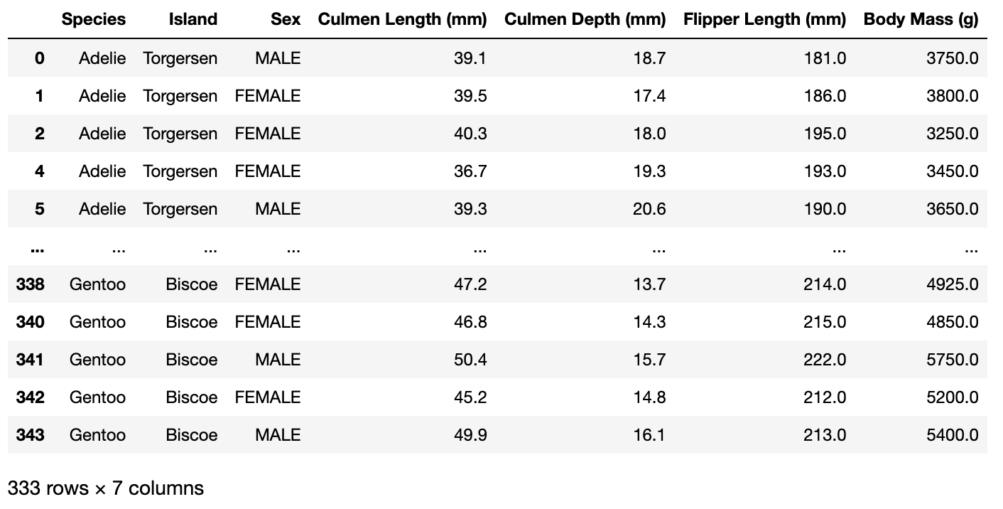
Here we do some preliminary data filtering, such as removing any NA values and respecifying our column names. Each column name gives a specific variable of interest for the penguins.
#data filtering
penguins = penguins.dropna(subset = ["Body Mass (g)", "Sex"])
penguins["Species"] = penguins["Species"].str.split().str.get(0)
penguins = penguins[penguins["Sex"] != "."]
#renaming columns
cols = ["Species", "Island", "Sex", "Culmen Length (mm)", "Culmen Depth (mm)", "Flipper Length (mm)", "Body Mass (g)"]
penguins = penguins[cols]
This is what our dataset looks like:
penguins
Step 2. Use an appropriate plot for the information that you want to visualize
Now that we have our dataset in proper format, it is time to choose some variables of interest that we would like to visualize. Here’s an example:
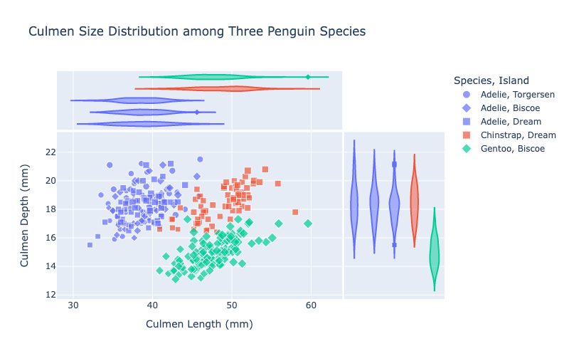
Say we wanted to compare the distribution of Culmen size (the length and width of the tip of the Penguin’s beak) accross various penguin species. One way to do this is to generate a plot of the penguins with the Culmen length as the x axis, and the culmen depth as the y axis.
Although we could generate seperate plots for each species, plotting them together and coloring them by species allows us to compare these distributions directly.
Step 3. Plot our data!
Here, we import the plotly.express module, which provides various plotting functions for visualization of our data.
We will be using the scatterplot function, which besides color, has various other arguments such as “size”, “symbol”, and “hover_data” which we can use to represent various other variables in our data set.
Here is an example where we color penguins by species. We give symbols corresponding to the island inhabited by the penguin, and set the size of the points to correspond to the penguins’ body mass.
In addition, we also use marginal plots (see “marginal_y” and “marginal_x” in the function parameters), which provide summary statistics of the data across either the x or y variable. For example, the x marginal plot gives violin plots of the culmen length distribution corresponding to each species and island, and the y marginal plot gives violin plots of the culmen depth distribution corresponding to each species and island.
from plotly import express as px

fig = px.scatter(data_frame = penguins, #dataset we want to visualize
                 title = "Culmen Size Distribution among Three Penguin Species", #figure title
                 x = "Culmen Length (mm)", #column from dataset to use for x axis
                 y = "Culmen Depth (mm)", #column from dataset to use for y axis
                 color = "Species", #column to use for color
                 size = "Body Mass (g)", #column to use for point size
                 symbol = "Island", #column to use for point symbol symbol
                 size_max = 8, # setting max point size
                 opacity = 0.7, #setting point opacity
                 hover_name = "Species", #column data to use as the title when hovering over data points
                 hover_data = ["Island", "Sex"], #column data to use when hovering over data points
                 width = 800, #width (in pixels) of the plot
                 height = 500, #height (in pixels) of the plot
                marginal_y = "violin", #specifying marginal plots gives supplementary summary statistics of x or y axes
                marginal_x = "violin")

# show the plot
fig.show()
 And now we’re done!
Note: plotly actually provides interactive plots, so if this code is actually executed in Jupyter notebook, hovering over the points would actually give the various statistics we provided in the hover_data and hover_title parameters.
And now we’re done!
Note: plotly actually provides interactive plots, so if this code is actually executed in Jupyter notebook, hovering over the points would actually give the various statistics we provided in the hover_data and hover_title parameters.
Have fun plotting!